The feedback from one of our users this morning was, “Wau, on kyllä siisti ja helppo käyttää,” which roughly translates to “Wow, it’s really cool and easy to use!” We’re thrilled to hear such positive feedback about the new user interface that we released yesterday.
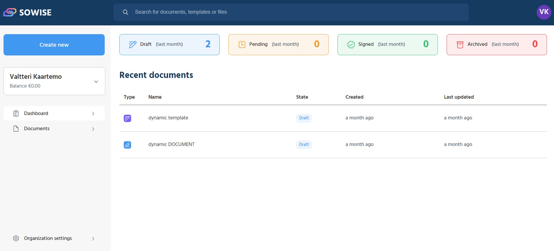
Our team at Sowise has been working tirelessly to create a modern and sleek design that makes it easier to create, edit and sign documents. The new UI lets our users navigate and distinguish more easily between templates, documents, and files in their browsers. We’ve also focused on improving the overall ease of use and intuitiveness of all functions in the software, making it faster and more convenient than ever before.

One of the features of the new UI that you may notice first is its informative dashboard, which provides quick access to recent documents. The dashboard is designed to provide users with everything they need in one place, allowing them to manage their signable documents with ease. The new UI also comes with more advanced roles and permissions settings, and a faster way to create documents from pre-designed templates. One of the new features associated with templates is pre-assigned signees. It means that you can determine already in the template who is going to sign the document (e.g., CEO, board members, or CFO). This is very helpful if you’re going to create dozens of documents using only one template. Now you can easily assign who needs to sign the document in advance, avoiding manual repetitive work, and saving you time and hassle.
The new UI also indicates when documents were created and when they were last modified, giving users more control and insight into their documents. And with a faster automatic refresh, Sowise users can enjoy a smoother, more seamless experience overall.
We also renewed the design in the registration process. It would be great to hear how that works for you. And if there’s anything we could do better to make it smoother.
Overall, we’re thrilled to have released this new UI and we’re excited to see how our users will respond to it. Rest assured, the new feature releases won’t stop here. The new UI has been designed in a way that enables us to publish new features faster than before. We will take a closer look at new features in our upcoming blog posts. If you haven’t already, be sure to check out the new UI and experience the difference for yourself (you can use most features with our freemium subscription)!